Faithlink
A brand and a website for a church platform with two apps, Church App and Sunday School, made to bring people together, not only to manage them.
In short
Problem
Church software runs the rota and the records. Nobody opens it to feel part of something.
What I did
A brand about connection, a family of two apps, and a website that shows the product working.
Result
Live at faithlink.app. The team builds its own marketing from the brand.
One mark, many links.
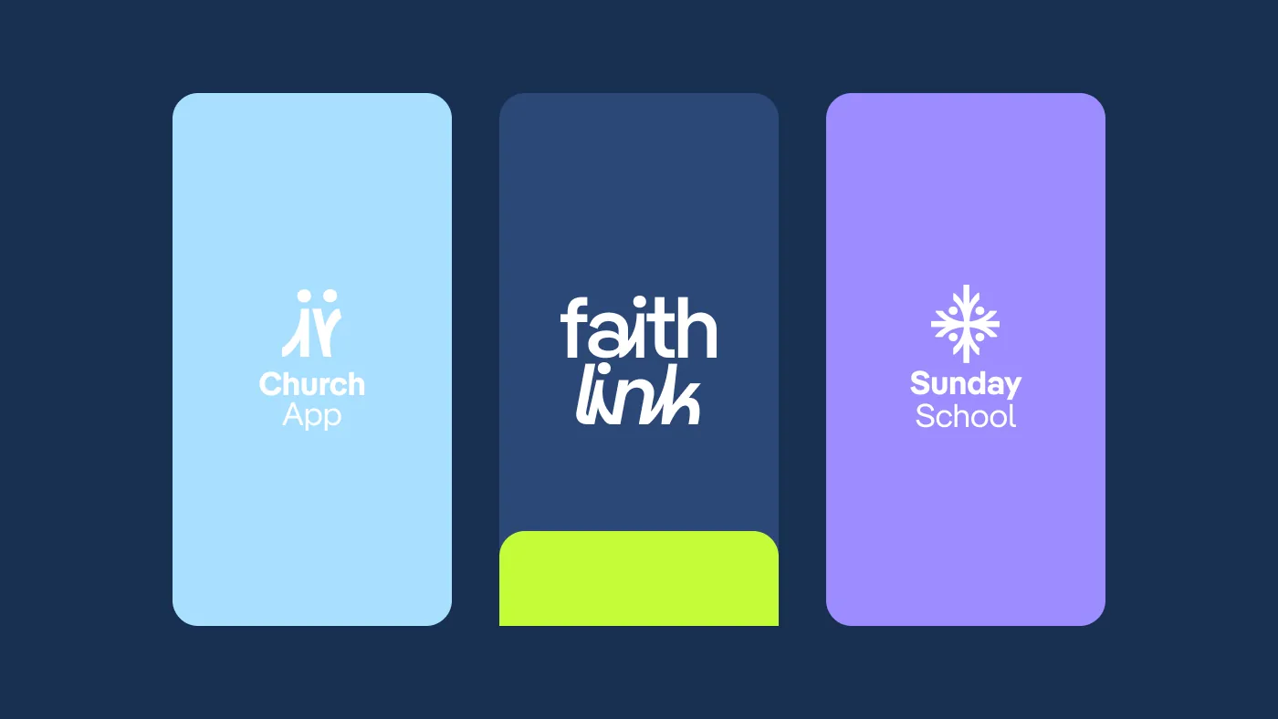
The mark is a set of linked shapes, people joined at the centre. Navy and lime for Faithlink, and one line to carry it: Together in Faith, Through Every Link.
A family, not a pile of features.
Two apps share one system and keep their own colour: light sky blue for the Church App, for community and calm; soft lavender for Sunday School, for growth and youth.
A website that shows the product.
No stock photos of smiling crowds: the app is on the first screen, and one switch moves between the two products.
Giving, and each church’s own app.
Four calls
Connection first
The brand talks about people and belonging, not modules.
Instead of feature lists in technical jargon
A colour per app
Blue for the church, lavender for Sunday School. You always know where you are.
Instead of two apps that look the same
The church’s own name
Each church sets its own icon and welcome screen in the app.
Instead of every parish wearing our logo
Giving without friction
An amount, a purpose, once or monthly. Done.
Instead of a long payment form
You bring the problem.
I bring the prototype.
A few lines about what you want to fix. The reply comes from me, within two days.
Start a conversation